Page 40 - enLIGHTenment January 2016
P. 40
home dÉcor trends
PANTONE’s Color of the Year =
Society’s Mirror
For the rst time, the blending of two shades – Rose Quartz
and Serenity – are chosen as the PANTONE® Color of the Year.
D
esigners may refer to the hues as PAN- bringing feelings of respite and relaxation even in
TONE 13-1520 and PANTONE 15-3919, turbulent times.”
but consumers will recognize them as The shades were selected as an inspirational
Rose Quartz and Serenity.
counterbalance to consumers’ stressed-out,
The Color of the Year is considered to be a time-constrained lifestyles: “As consumers seek
“symbolic” selection, “a color snapshot of what we mindfulness and well-being as an antidote to
see taking place in our culture that serves as an modern-day stresses, welcoming colors that
expression of a mood and an a itude,” notes the psychologically ful ll our yearning for reassur-
renowned Color Institute on its Web site.
ance and security are becoming more prominent.
This is the rst time that two shades have been Joined together, Rose Quartz and Serenity dem-
selected as the o cial PANTONE Color of the onstrate an inherent balance between a warmer
Year. The Web site explains, “Rose Quartz is a per- embracing rose tone and the cooler tranquil blue,
suasive, yet gentle, tone that conveys compassion re ecting connection and wellness as well as a
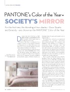
Surya’s Clara series for
the bedroom taps into the and a sense of composure. Serenity is weightless soothing sense of order and peace.”
and airy, like the expanse of the blue sky above us,
There is another cultural phenomenon that the
Rose Quartz trend.
blending of these two shades symbolizes. Com-
monly perceived as Baby Blue and Baby Pink,
these shades were chosen to re ect the “gender
blur as it relates to fashion, which has in turn im-
pacted color trends throughout all other areas of
design. This more unilateral approach to color is
coinciding with societal movements toward gen-
der equality and uidity, the consumer’s increased
comfort with using color as a form of expression,
a generation that has less concern about being
typecast or judged, and an open exchange of
digital information that has opened our eyes to
di erent approaches to color usage,” according to
the Web site.
To help consumers select good complementary
colors, the PANTONE site suggests pairing the
combo with other mid-tones including greens and
purples, rich browns, and all shades of yellow and
pink. Silver or hot brights can be added for more
splash and sparkle.
38 enLIGHTenment Magazine | January 2016
www.enlightenmentmag.com


