
Page 61 - Lighting Magazine February 2020
P. 61
different styles from Traditional to Mid-Century Modern to Contemporary,” Bradley says. “It’s calm- ing, stable, and timeless.”
Gil Walsh – owner of Gil Walsh Interiors, which operates out of West Palm Beach, Fla. and Martha’s Vineyard in Massachusetts – agrees, believing that every home’s scheme should incorporate at least some blue.
“Whether it’s at the forefront of the entire theme, or selecting the perfect shade of blue for accent cushions, area rugs, and upholstery fabrics, blue is universal, and the shade you select commu- nicates the message you want to impart about the overall room design,” Walsh says.
When thinking about what to pair with Classic Blue, Walsh prefers to use white or neutrals and light-colored, textured window coverings, allowing blue to be the focal point. But don’t be afraid to up the ante even more, Walsh says. “If you want to add another pop of color, I always suggest red!”
How MercHanDisers Use it
Dennis Beard, Design Director at Designers Foun- tain, used Classic Blue in a big way during the recent Lightovation show at Dallas Market Center, where he created a window display featuring sev- eral blue shades.
Beard – who was a fashion major, an opera singer, and a theatrical prop builder before work- ing in the industry as a lighting designer – made the entire display himself. He purchased and washed 150 yards of fabric to give it a weathered look, then tore all of the fabric into pieces that measured 11/2 to 2 inches wide and cut them into lengths from 12 to 15 inches, hand-tying thousands of these strips to create the ombre effect. The wall behind the hangings was painted with 5 to 6 shades of blue as well. Beard says that he consulted the Pantone app for the Color of the Year when he and the Designers Fountain team were choosing their color palette.
“I chose blue because of the ocean — inspired from Los Angeles where Designers Fountain is located — plus I wanted a cool color. It worked well with the gold in my new fixtures, hung in the window.”
Whether incorporating a hue akin to Classic Blue into your product mix, or creating a dramatic display like Beard did, representing this color in your store in 2020 will position you as an on-trend destination.
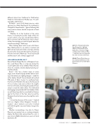
left: The Morada table lamp, from Generation Lighting’s C&M by Chapman & Myers Collection, is shown in Indigo, a shade similar to Classic Blue — a perfect way to incorporate the color into your showroom.
below: Classic Blue helps cre- ate a nautical ambiance in this guest bedroom from Gil Walsh Interiors.
BOTTOM: KELLY FRERE OF SIGHTLINE INTERIORS PHOTOGRAPHY
February 2020 | enLIGHTenment Magazine 59
