
Page 60 - Lighting Magazine February 2020
P. 60
NOW& NEXT with Nicole Davis
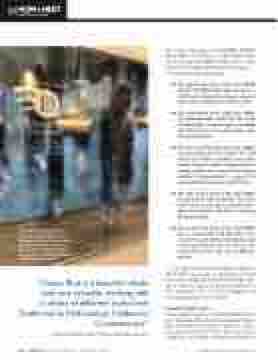
The showstopping fabric hangings in the window of the Designers Fountain showroom at the Dallas Market Center took Design Director Dennis Beard many hours, including weekends and evenings, to create.
“Classic Blue is a beautiful shade and very versatile, working with a variety of different styles from Traditional to Mid-Century Modern to Contemporary.” —Veronica Bradley, owner of Veronica Bradley Interiors
the emotional properties of PANTONE 19-4052 Classic Blue, motivated us to expand beyond the visual, to bring the 2020 Pantone Color of the Year to life through a multi-sensory experience.”
Multisensory elements include:
ß The sight of the Color of the Year 2020 Pantone 19-4502 Classic Blue: Known as a restful color, Classic Blue brings a sense of peace and tranquility to the human spirit.
ß The sound of the Color of the Year 2020, in partnership with Audio UX: The sound of Classic Blue, Vivid Nostalgia, is nostalgic and takes listeners to a place that’s com- forting and familiar.
ß ThetextureoftheColoroftheYear2020, in partnership with The Inside: The feel of the color fabric translates into a soft, velvety texture, further emphasizing the calming quality of the color, while eliciting feelings of empowerment to expand the mind and build foundation for the future.
ß The taste of the Color of the Year 2020, in partnership with Firmenich: The taste of the color is described as gentle and el- egant, and explores the idea of maturing through ripening.
ß The scent of the Color of the Year 2020, also in partnership with Firmenich: The scent of the color elicits contemplation and a feeling of optimism for the future, with notes of blue water and sea salt lifted by airy sky.
As is evidenced by Pantone’s approach this year, Classic Blue can provide an experience in and of itself. How can lighting and home furnishings retail- ers use Pantone’s pick in a way that’s impactful for their customers? Turn to interior designers and visual merchandisers for inspiration.
How Designers Use it
Veronica Bradley, owner of Veronica Bradley Interi- ors in Columbus, Ohio, loves to incorporate Classic Blue into a room with pillows, artwork, or a state- ment piece of furniture. “Classic Blue is a beautiful shade and very versatile, working with a variety of
58 enLIGHTenment Magazine | February 2020
www.enlightenmentmag.com
